

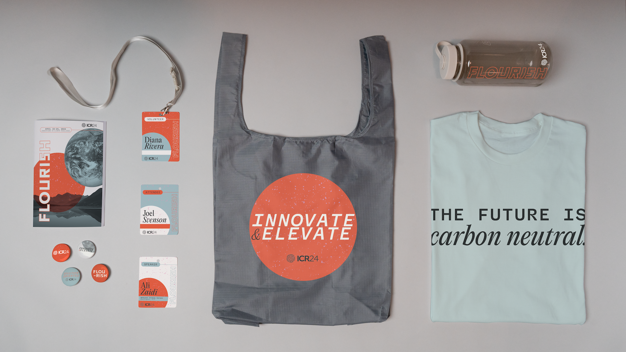
Flourish is a branding system for an annual conference that brings together scientists and policymakers who are working to combat climate change. A clear and cohesive aesthetic for this event aims to underline the importance of the subject matter and the credibility of the attendees while also providing a fresh and hopeful vibe.
Flourish pairs a playful yet refined color palette with a typographic system rich with academic and scientific vibes to offer a clean and contemporary feel to the conference. A rigid geometric theme logo works together with an orb motif to gently hint back to the ultimate goal of the conference: caring for our Earth.

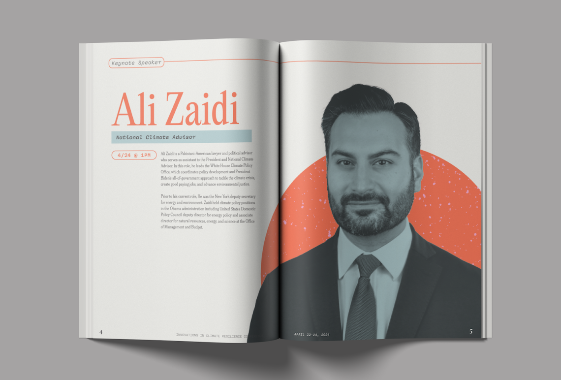


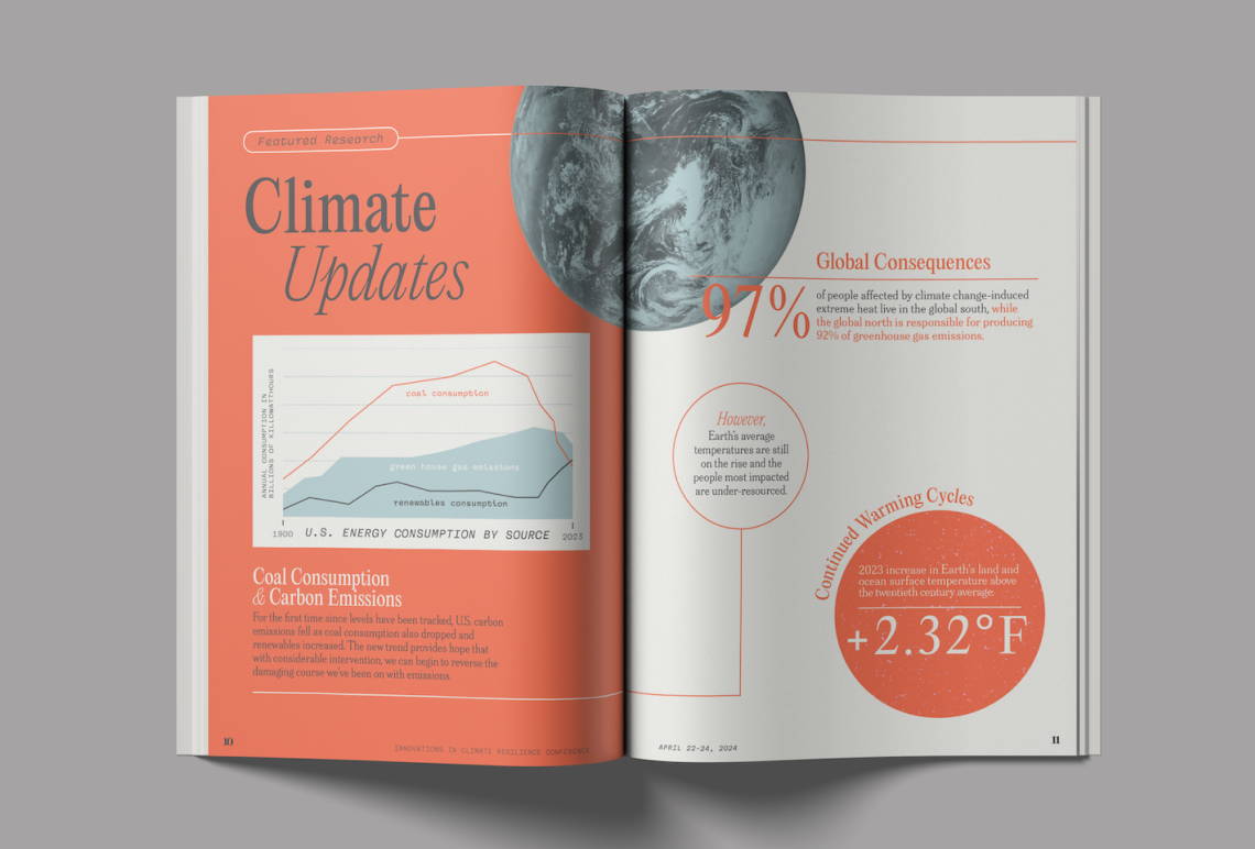


Focusing on the theme of "Flourish", I sketched by hand to try out options for a theme logo as well as directions for booklet layouts. I created a color palette of warm, muted neutrals evoking sustainability and pairing them with a lively red-orange for vibrance and finally a cool, gentle blue. I iterated on a single spread of the conference booklet until I gained a clear understanding of the system which I used to build out the rest of the deliverables.
.gif)


