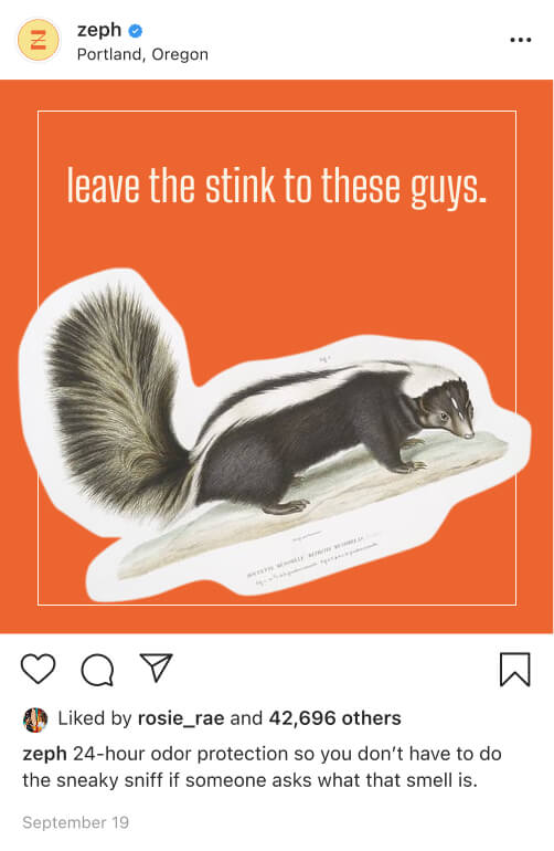
Zeph is a gender-neutral deodorant brand that celebrates the daily rituals of hygiene with a funky twist on a simple, utilitarian design. The visual language for the brand aims to disrupt this gendered space with a simple and nostalgic feel applied to an eco-friendly substrate that differentiates this product from the plastic-lined shelves of the deodorant aisle.
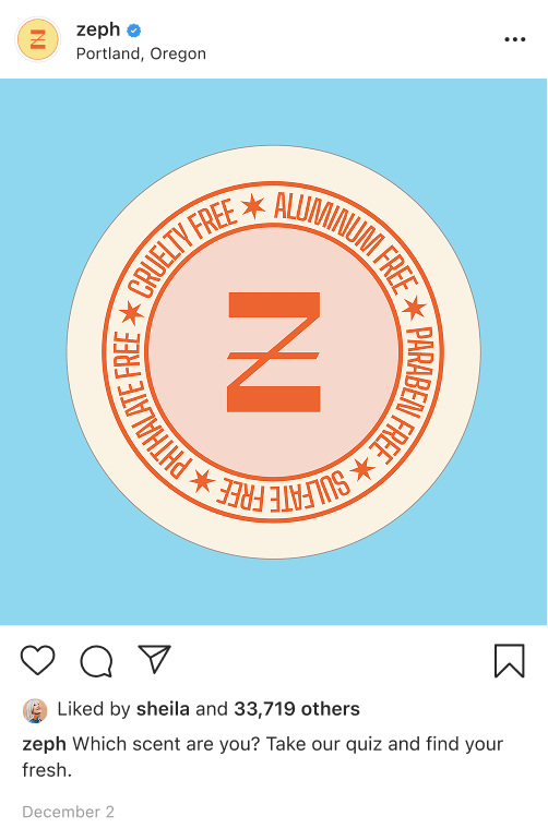
Zeph uses a vintage color palette and a condensed sans serif to hearken to the idealized simpler days of the past. Curated color pairs and a basic pattern motif communicate the scent experience of each variant. A sealing sticker reiterates the scent and ensures a tamper-proof seal while a crest on the lid touts the health- and planet- conscious advantages of Zeph’s formula.
Beginning with dozens of pencil & paper sketches to explore vintage-inspired lettering for the brand's logo, I moved on to a modified-type logo that reinforces the functional & funky modernist feel of Zeph. I nestled the logo in a packaging system that brings together old fashioned masculine sensibilities of card decks and cigarette packs with a fresh, pastel-forward color palette.


The final system for Zeph came together as a bright, poppy aesthetic brings life and energy on top of the sustainable cardboard packaging. The four scents are named simply with basic adjectives and rely on their unique color pairings and patterns to convey their specific qualities.